Context
On-demand traffic has already been successfully implemented at several customers (transport companies). However, operations are not yet running smoothly and there are regular incidents that disrupt operations and impair quality. A dashboard is now to be implemented for monitoring on-demand traffic, which enables an operator (employee in a control center, see also Link) to obtain an overview of the operation and the status of the traffic on one page.
01. Short description of the steps and the associated deliverables
UX research and feedback harvesting. At the end of these processes we can define the most important projects' objects and focusing on them for our specific solutions.
Benchmarking our competitors. To keep in mind what we provide and what we can't provide yet. Our solution can match our missing features, becoming an unique strenght.
Create a prototype. In order to easily focus on the different product areas and provide a fast internal A/B testing.
Adding the visul touch and get the attention of our key point for the user. The result will be our first MVP, with the aim to achieve it in the final design and development.
02. Conduct research to learn what data is relevant and important
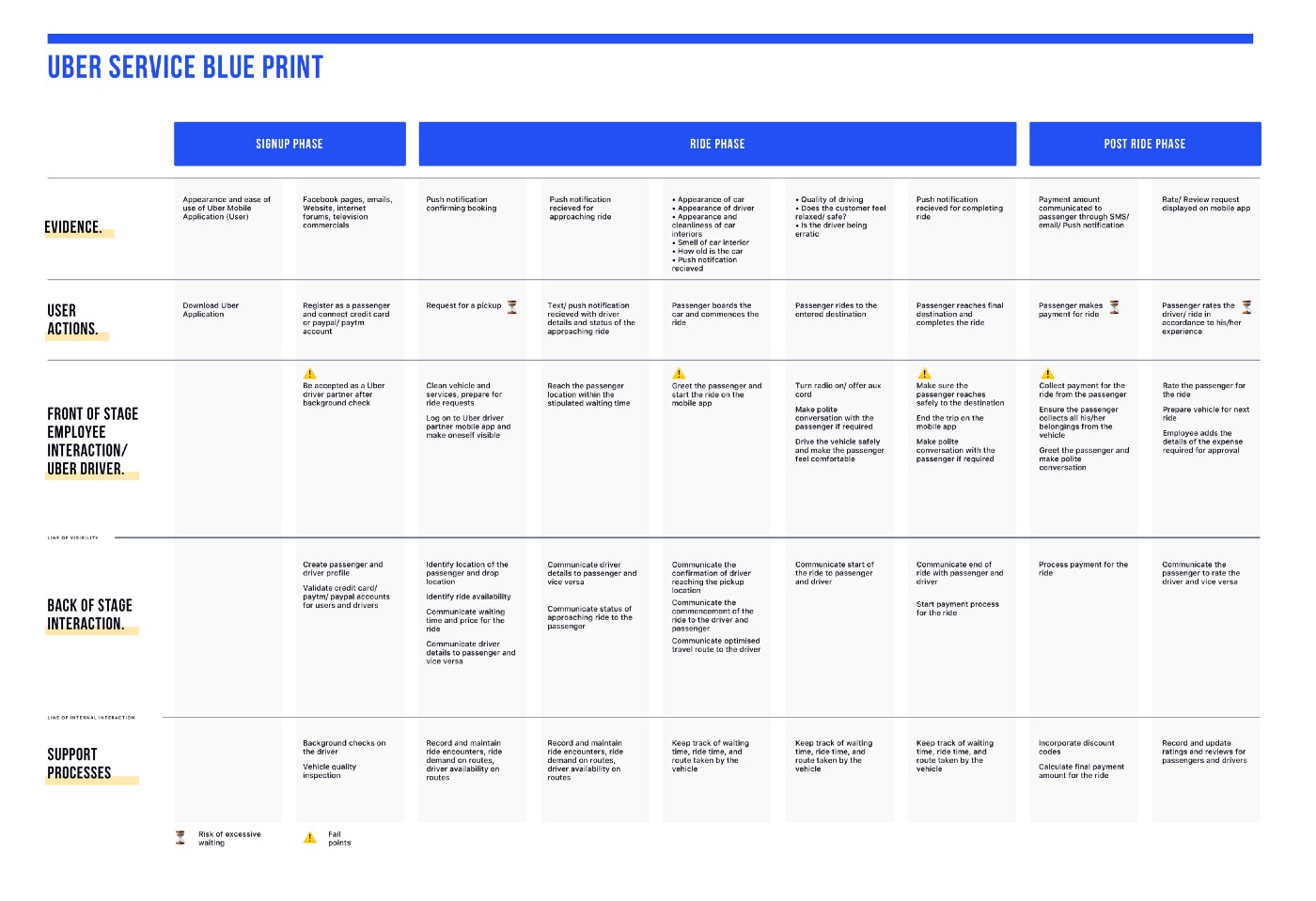
UX research with Service Blue Print, to map out all the stakeholders.
NPS (Net Promoter Score) survey, plus in-app feedback tool for customers at the end of the ride.
Drivers usablity testing, to get qualitative feedback on a daily driver journey.
Service Blueprint: Service design is a process which helps businesses to organize their resources — people or stakeholders, infrastructure, communication, materials, and processes to improve its experience and interaction between the business and its customers.
After step 1: identifying the scenario, step 2: Identify all the frontstage actors involved in delivering the service and recognize their actions, responses, and experiences, step 3: Outline and link all background and backstage activities and processes, now we can focus on the step 4: Indicate Critical Moments.
On-demand traffic has already been successfully implemented at several customers (transport companies). However, operations are not yet running smoothly and there are regular incidents that disrupt operations and impair quality. A dashboard is now to be implemented for monitoring on-demand traffic, which enables an operator (employee in a control center, see also Link) to obtain an overview of the operation and the status of the traffic on one page.
01. Short description of the steps and the associated deliverables
02. Conduct research to learn what data is relevant and important
Service Blueprint: Service design is a process which helps businesses to organize their resources — people or stakeholders, infrastructure, communication, materials, and processes to improve its experience and interaction between the business and its customers.
After step 1: identifying the scenario, step 2: Identify all the frontstage actors involved in delivering the service and recognize their actions, responses, and experiences, step 3: Outline and link all background and backstage activities and processes, now we can focus on the step 4: Indicate Critical Moments.
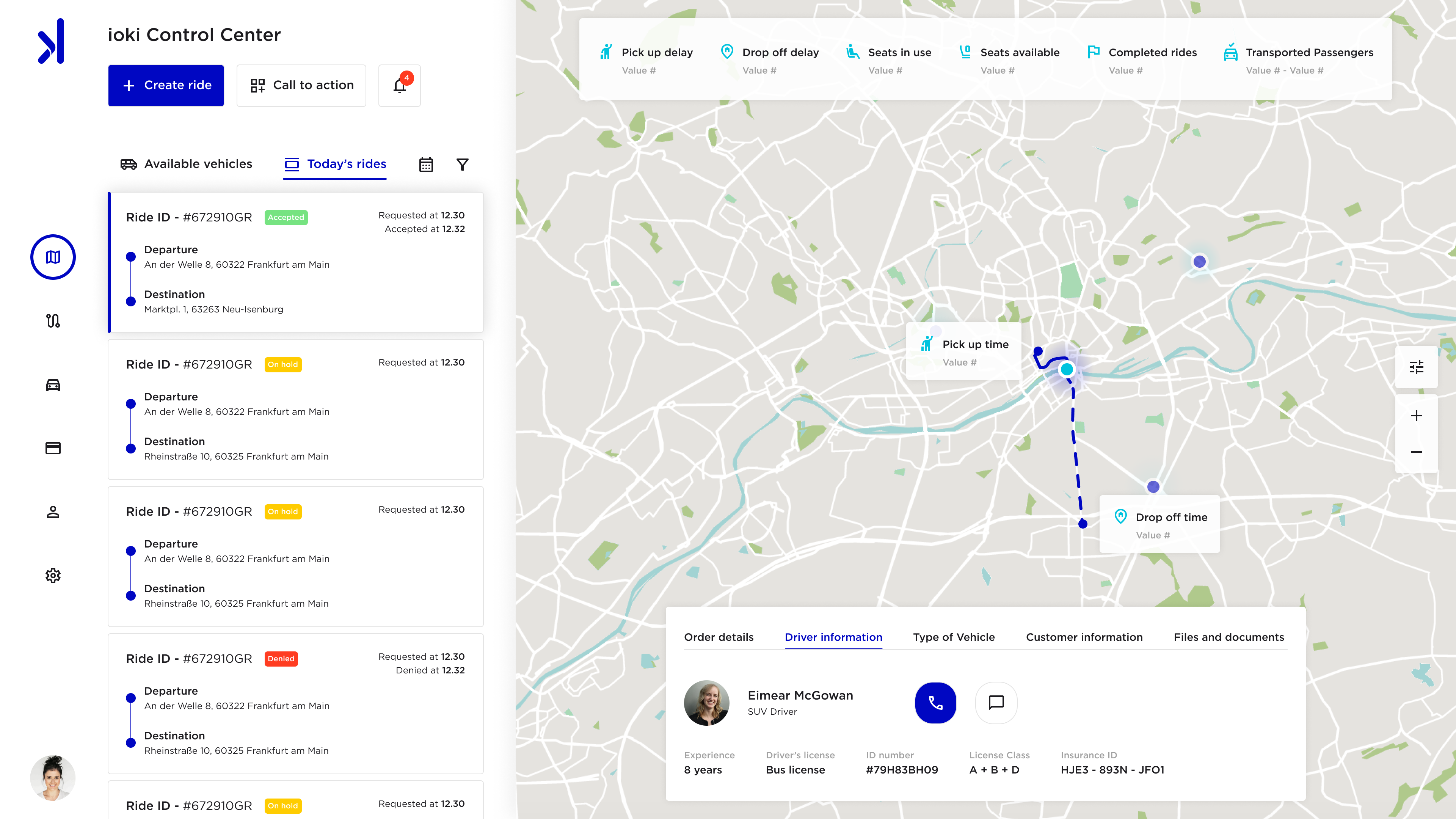
03. Important informations and data
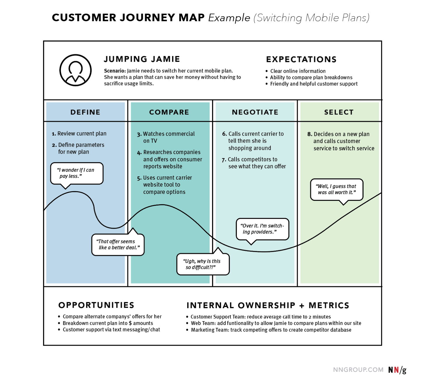
From our Blueprint we can extract information regarding the actions and decisions, that a Command Center Expert has to take on a daily basis in each ride situation.
We can definitely combine those information with a detailed jorney map of users' customers. Starting from the qualitative and quantitative feedback that we collected, throughout the other feedback tools above mentioned.
In particular we can make assumption of the users emotions. During their steps, actions, defining their mindset in an actual user persona.
Actions are the actual behaviors and steps taken by users. This component is not meant to be a granular step-by-step log of every discrete interaction. Rather, it is a narrative of the steps the actor takes during that phase.
Mindsets correspond to users’ thoughts, questions, motivations, and information needs at different stages in the journey. Ideally, these are customer verbatims from research.
Emotions are plotted as single line across the journey phases, literally signaling the emotional “ups” and “downs” of the experience. Think of this line as a contextual layer of emotion that tells us where the user is delighted versus frustrated.
04. Sketch of a simplified information architecture
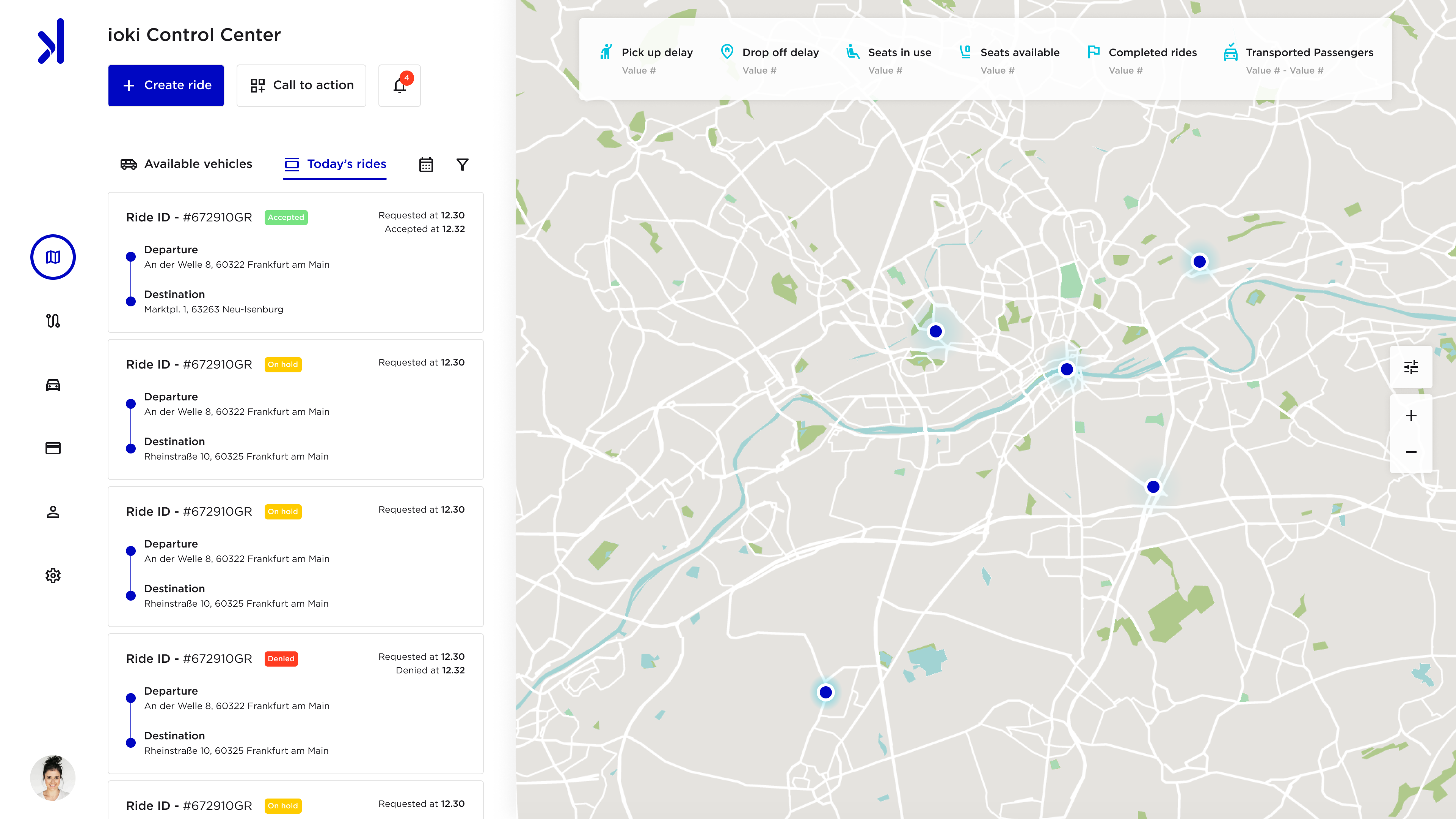
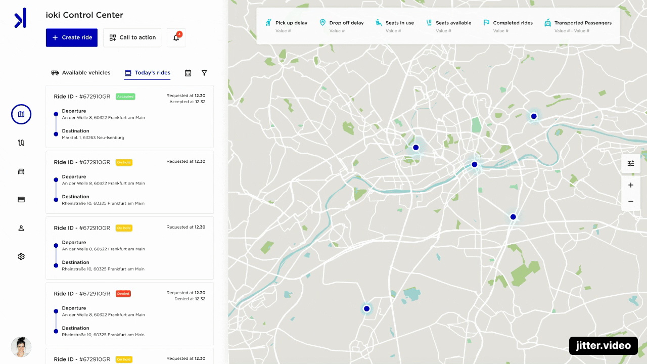
If we take a look at the example from ioki’s website, we can notice that the main page of the Control Center is built to be read vertically.
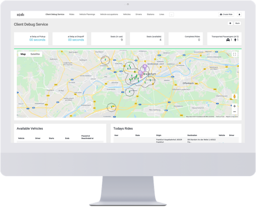
This construction is definitely more valuable for a website homepage or a landing page, where the company’s several products are divided into sections.
The user will read this page each section from left to right (or right to left in Arabic speaking countries), meaning a disconnection between supposed connected information. We can take as an example the map and those squared boxes on top of it, with meaningful info for the logistic expert on charge.
At the corner on top right appear 4 different CTAs all together, with most likely different behaviors and actions, as we can imagine because of a background division. This is something that can happen if we force ourselves to use a specific structure. That sometimes doesn’t fit into all our needs to show several icons and Call to actions.
The map is not necessarily needed horizontally as we can have rides with vertical paths. Also, those 2 different tabs underneath the map are invisible at a first glance. That means that I have to decide on which part of my working flow I have to look at, without the possibility to have everything important of the control map under my watch.
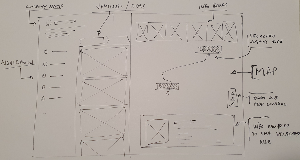
Focusing on a few key points we can solve these first main problems:
Having the main navigation on the left side will lead the sight horizontally, to go on one direction only
The map on the right side can stretch horizontally on a different device, but sticks vertically on every screen
The boxes with our traffic information are placed directly on top of the map
Between navigation and map we will have those info tables with Vehicles and Rides info, which will be the only scrollable objects and interchangeable via tabs (if needed we could think of custom accordion option that develops vertically)
If we take a look at the example from ioki’s website, we can notice that the main page of the Control Center is built to be read vertically.
This construction is definitely more valuable for a website homepage or a landing page, where the company’s several products are divided into sections.
The user will read this page each section from left to right (or right to left in Arabic speaking countries), meaning a disconnection between supposed connected information. We can take as an example the map and those squared boxes on top of it, with meaningful info for the logistic expert on charge.
At the corner on top right appear 4 different CTAs all together, with most likely different behaviors and actions, as we can imagine because of a background division. This is something that can happen if we force ourselves to use a specific structure. That sometimes doesn’t fit into all our needs to show several icons and Call to actions.
The map is not necessarily needed horizontally as we can have rides with vertical paths. Also, those 2 different tabs underneath the map are invisible at a first glance. That means that I have to decide on which part of my working flow I have to look at, without the possibility to have everything important of the control map under my watch.
Focusing on a few key points we can solve these first main problems:
05. Important requirements for the UI
Our map must be clean and clear for the Logistic Expert, who needs to take short term decision. Understanding immediately the problems over a specific ride.
Different colored labels are very important to clarify the status of the today's rides. Accepted or denied from a driver, as well as for the day calls still on hold.
Even if we are going to use the same color for Primary CTAs and Active states for menu buttons, the look and feel should be different. In this case a full background for CTAs and Outlined state for active buttons.
The division between our three main sections should be easy to understand. Playing with shapes we can avoid the usage of different background colors, which can make everything a bit heavier to look at.
Actual times are the only right aligned objects. They can in this way stand out without aggressivly take the stage, or adding another left layer on the rides cards.
Thank you