Highlighting the spots
Analyzing the current website we can ping some crucial pain points, in order to help ourselves on how to take action.
Analyzing the current website we can ping some crucial pain points, in order to help ourselves on how to take action.
First steps into prototyping
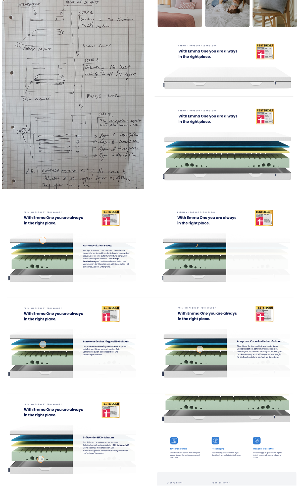
Sketching on paper is always a good approach to immediately visualize what we have in mind for our product evolution. With further iterations, this first attempt will be changed during the design construction. At least we can define our layout and structure the main areas/sections.
Sketching on paper is always a good approach to immediately visualize what we have in mind for our product evolution. With further iterations, this first attempt will be changed during the design construction. At least we can define our layout and structure the main areas/sections.
UI process
After some benchmarking we are able to tackle the UI of our website. Comparing other similar websites help us on thinking what features suit us best and we can align them to our Vision and Visual Design.
After some benchmarking we are able to tackle the UI of our website. Comparing other similar websites help us on thinking what features suit us best and we can align them to our Vision and Visual Design.
Emma main products interaction
With having all the three products in a section that takes over the entire device screen height, we are basically telling to our user how good they can fit together. We do not necessarily need to show the actual bed or pillow, the main menu is following us for that purpose. Instead we should focus on the storytelling and the feeling or perception that we want to transmit.
With having all the three products in a section that takes over the entire device screen height, we are basically telling to our user how good they can fit together. We do not necessarily need to show the actual bed or pillow, the main menu is following us for that purpose. Instead we should focus on the storytelling and the feeling or perception that we want to transmit.
The premium product
Playing the discovering game with our users is always a optimal feature to explain WHY they should buy our product instead of another one. The user achieves a result interacting with the object on the screen, that shows with transparency all the aspects of each layer.
Playing the discovering game with our users is always a optimal feature to explain WHY they should buy our product instead of another one. The user achieves a result interacting with the object on the screen, that shows with transparency all the aspects of each layer.
Plus section
Even if this is not relevant for the purpose of selling, the dark-mode toggle is nevertheless considered already a common website feature. This is a friendly way, in line with the company business, to rob a smile to our users and possible future customers.
Even if this is not relevant for the purpose of selling, the dark-mode toggle is nevertheless considered already a common website feature. This is a friendly way, in line with the company business, to rob a smile to our users and possible future customers.